KIDS BATHROOM REFACE WITH WAYFAIR

IMG_0021.jpg

Wow is all I can say to this project! You know when you have old kitchen cabinets and you reface them, or you have an old bathtub/shower area and you go over the existing bathtub/shower to make a brand new one? Well, that’s pretty much what we did to our kid’s bathroom that was original to the house, built in 1940. Even the toilet was the original with the date stamped on the cover of the tank…September 30, 1940! This is a tiny bathroom, about 30 sq. ft., so we did not have a lot of room for error, literally or figuratively! One question kept plaguing us…How could we redo this bathroom without gutting it? The tile up the wall definitely had cement, chicken wire and Lord knows what else behind it. We did not have the patience or the money to hire out the work and did not want to take that on ourselves. Soon enough, I came up with a plan! We could shiplap over the tile walls and tile over the original floor. we decided to leave the shower area as is, because the shower curtain would hide that. We replaced the window, toilet, vanity, faucet, mirror, light fixture, all towel fixtures and added all new decor! We basically gutted this bathroom, without actually gutting it and achieved the same result without the cost and the mess! It’s as if we slipped an entirely new room over an old one, perfectly, only losing some space, but adding so much character and charm!

IMG_0031.jpg
IMG_0022.jpg

So, what materials did we use, how did we do it and how much did it cost? Here are all the answers to all of these questions!

Material and Steps (Note, this project was completed in partnership with Wayfair):

  • We started by framing it with these furring strips. To get these in place, Mr. Seasoned Home had to use a wood drill bit to get through the wood strips, a tile drill bit to get through the tile, then a cement drill bit to get through the cement behind the tile and then had to use special, cement screws to anchor the wood to the cement.

  • To avoid shadows and seeing the tile/wood behind the shiplap boards, we had to put this white plastic panel over the wood.

  • Once that was up, we put up the boards of shiplap. We knew we didn’t want to use wood because of all the moisture and size of the room, so we found a PVC board that could hold up to all elements.

  • We spaced each board two nickels thick and nailed them to the frame. Once the walls were done, we used this cement tile that we had leftover from our fireplace redo last fall. We had just enough, with 4 tiles to spare.

  • We did the tile second, because we knew the room would be getting smaller and we had limited tile, so we wanted to use as little as possible. Mr. Seasoned Home cemented, tiled, sealed and grouted the floor himself.

  • We had a plumber come in to hook up the new toilet vanity and faucet took him about 2-3 hours.

  • Once those were in, Mr. SH trimmed out the room with the same type of PVC boards and caulked all seams. We removed the old door because it opened into the room and cut off even more space. We got this barn door and hanging kit and will install that when it comes in.

IMG_0041.jpg
IMG_0043.jpg
IMG_0042.jpg

How much did it cost? (Note this project was completed in partnership with Wayfair)

  • Furring strips – we used (3) 9 packs. Each pack was $13.50, so total $40.50

  • White plastic panel – we used 3. Each was $21, so total $$63.00

  • Shiplap boards – They come in 2″, 3″, 4″ and 6″ widths. We used the 6″ for the walls and many other sizes and variations for trim, etc…Total cost was around $1000.

  • We used 56 tiles at around $11.00 a sq. ft. The tile would have cost around $300

  • The toilet was $150

  • The plumber was $300

  • The window was $115

  • The shade was $60

  • All decor was around $180

  • Odds and ends of nails, screws, cement, caulk, etc was an additional $100

  • Vanity, mirror, light fixture, and faucet were provided in partnership with Wayfair and were around $1200

So total cost for this project was around $3,500.

Thank you to Wayfair for their amazing customer service, fast shipping and continued support and partnership! We couldn’t ask for a nicer company to work with!

IMG_0023.jpg
IMG_0036.jpg
IMG_0024.jpg
IMG_0037.jpg
IMG_0028.jpg
IMG_0035.jpg
IMG_0025.jpg
IMG_0038.jpg
IMG_0027.jpg

OUR DECK EXPANSION

IMG_0078.jpg

How much space did we gain? What materials did we use? What plantings did we choose? What was the cost of this DIY? All your questions will be answered here in this blog post! As many of you know, we decided to tackle expanding our deck this summer! It was a labor of love, for sure, but one that, in the end, we knew would be worth it!

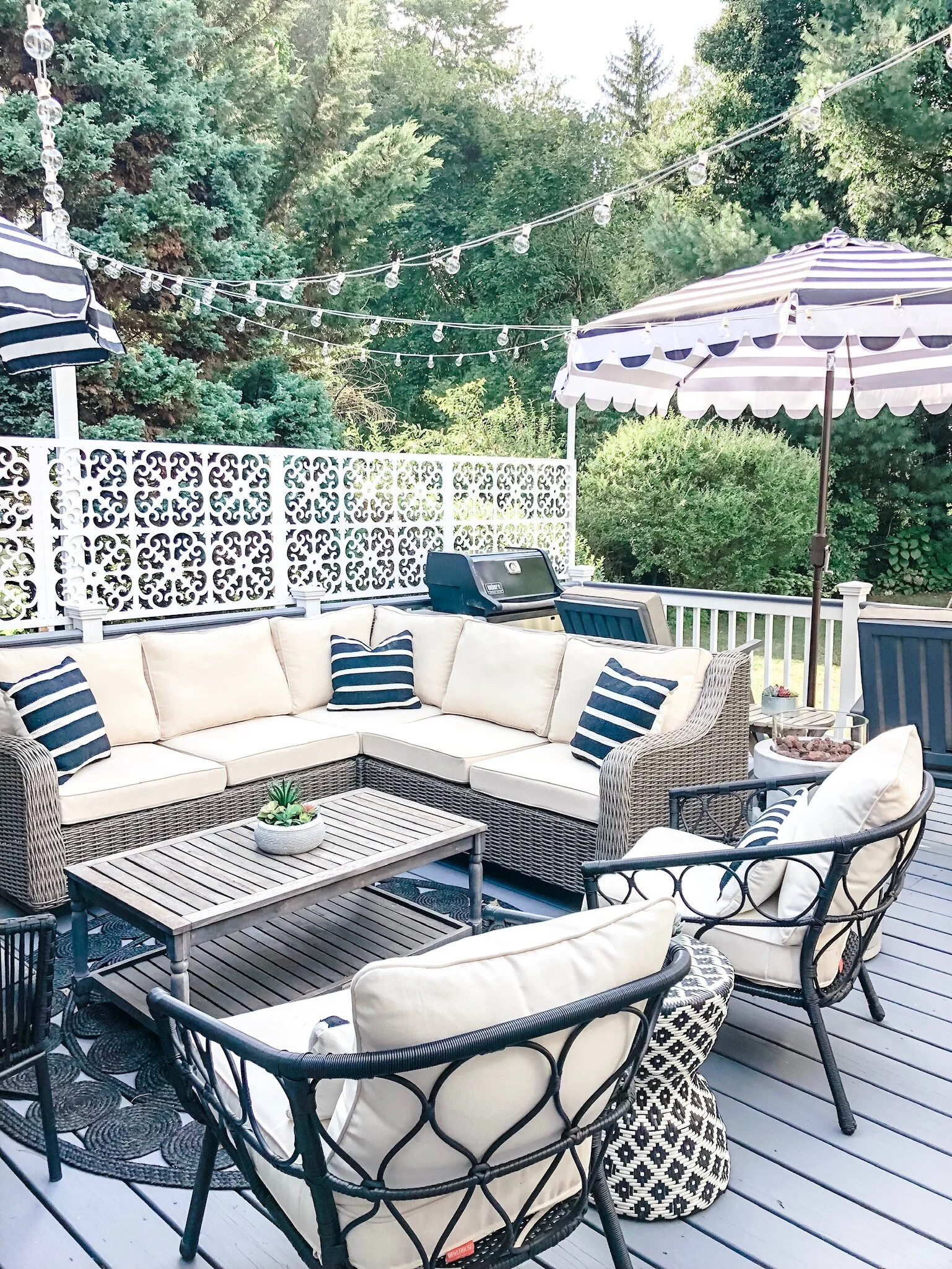
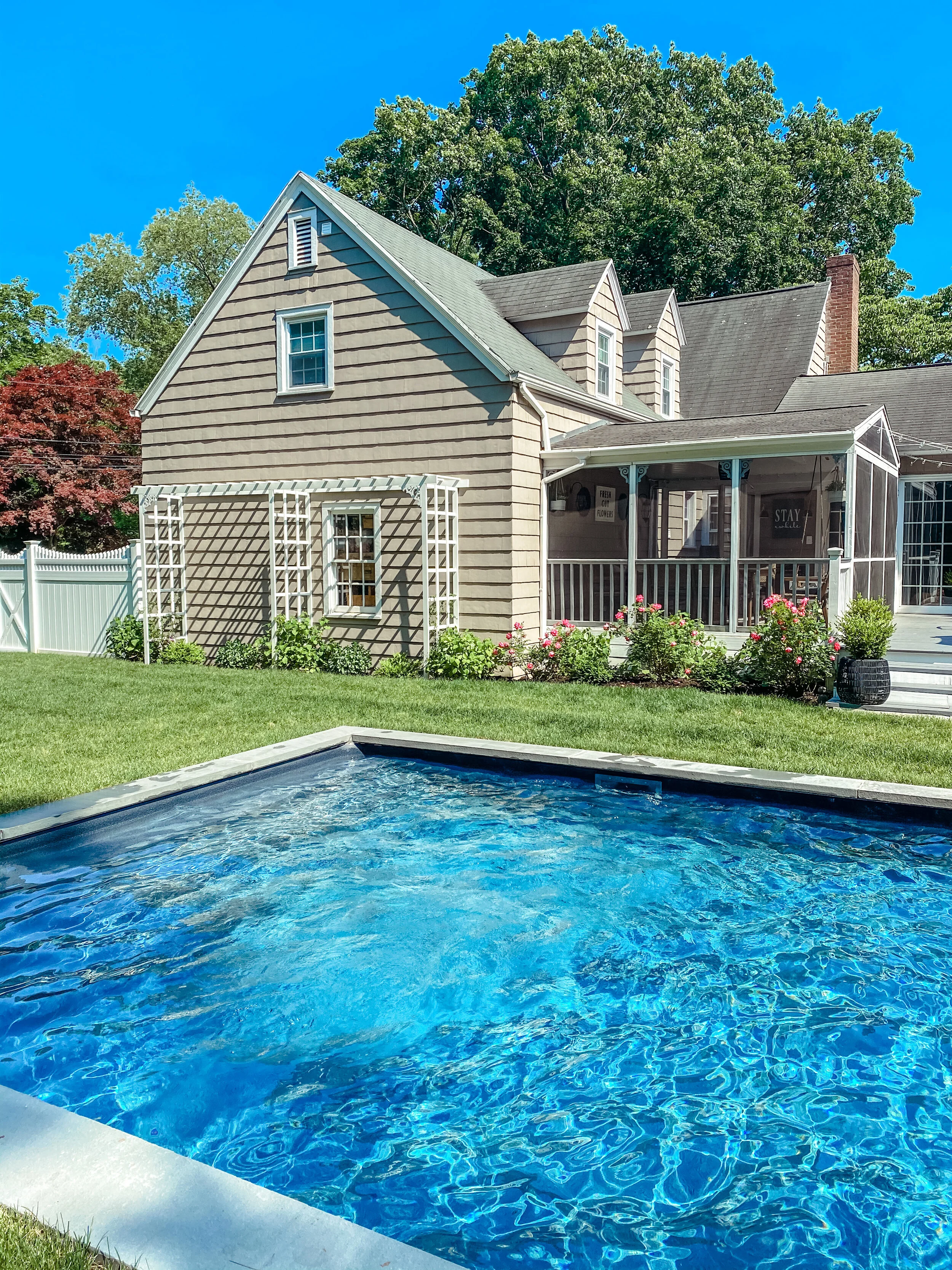
Our first, and really only, obstacle was the large well that was original to the house. Though it was neat looking, after 16 years here, we decided that was not enough to keep us from moving it any longer! It caused our deck to make a sharp angle and cut into a lot of usable space. For a long time I fought taking it down because of its history to our house, but in the end, function won! We added about 80 sq ft of deck space.

 Landscaping before

What was the cost…We spent about $150 on cement footings and the cement, cement mixer and concrete forming tubes. The frame lumbar was pressure treated from Home Depot and cost about $300. The decking boards were pressure treated 5/4′ premium decking boards from a local lumbar yard and we spent $250 on those. The Railing were Home Depot pre-built railings, hand rail, and square cap. We needed three and each was $60 so $180 on that. The skirting was 1x6x12 boards and cost about $100. We paid to have the entire floor and the NEW railings and skirting painted for $350. To landscape the entire side of the house and porch/deck was $375 for 5 hydrangeas, 6 boxwood plants and 2 sedum plants as well as mulch from home depot.

IMG_0079.jpg
IMG_0074.jpg
 

LIVING ROOM REDO WITH RAYMOUR AND FLANIGAN

Thank you to raymourflanigan.com for kindly sponsoring this post. All opinions are 100% honest & completely my own.

All products in this post have been provided by Ramour & Flanigan

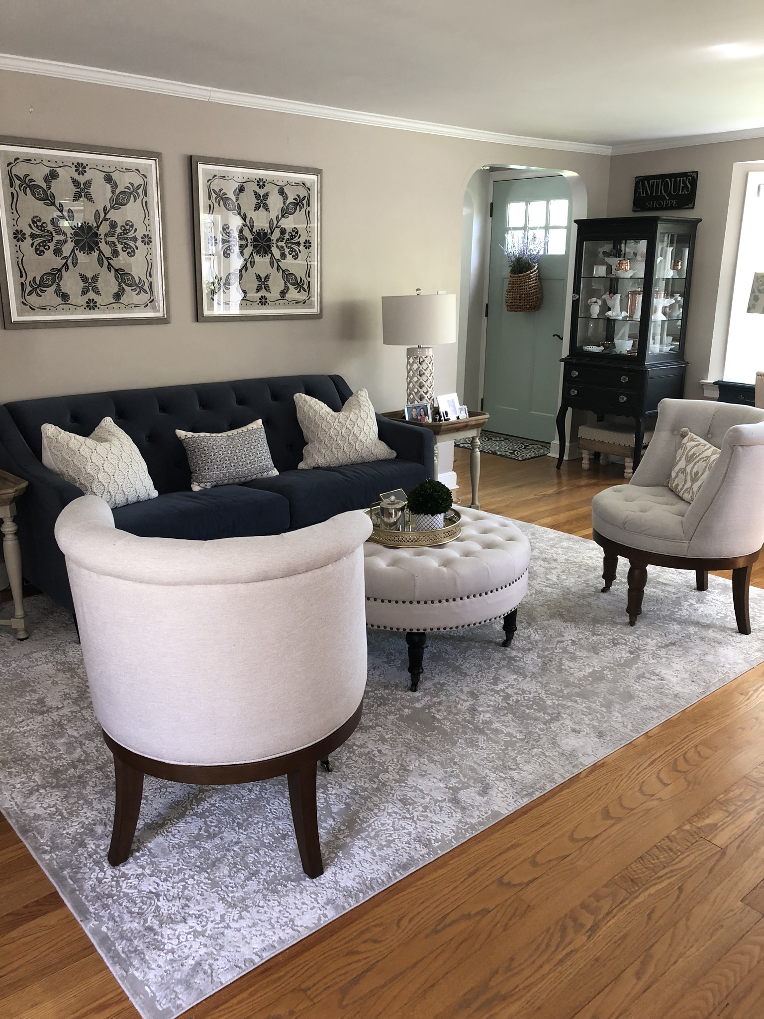
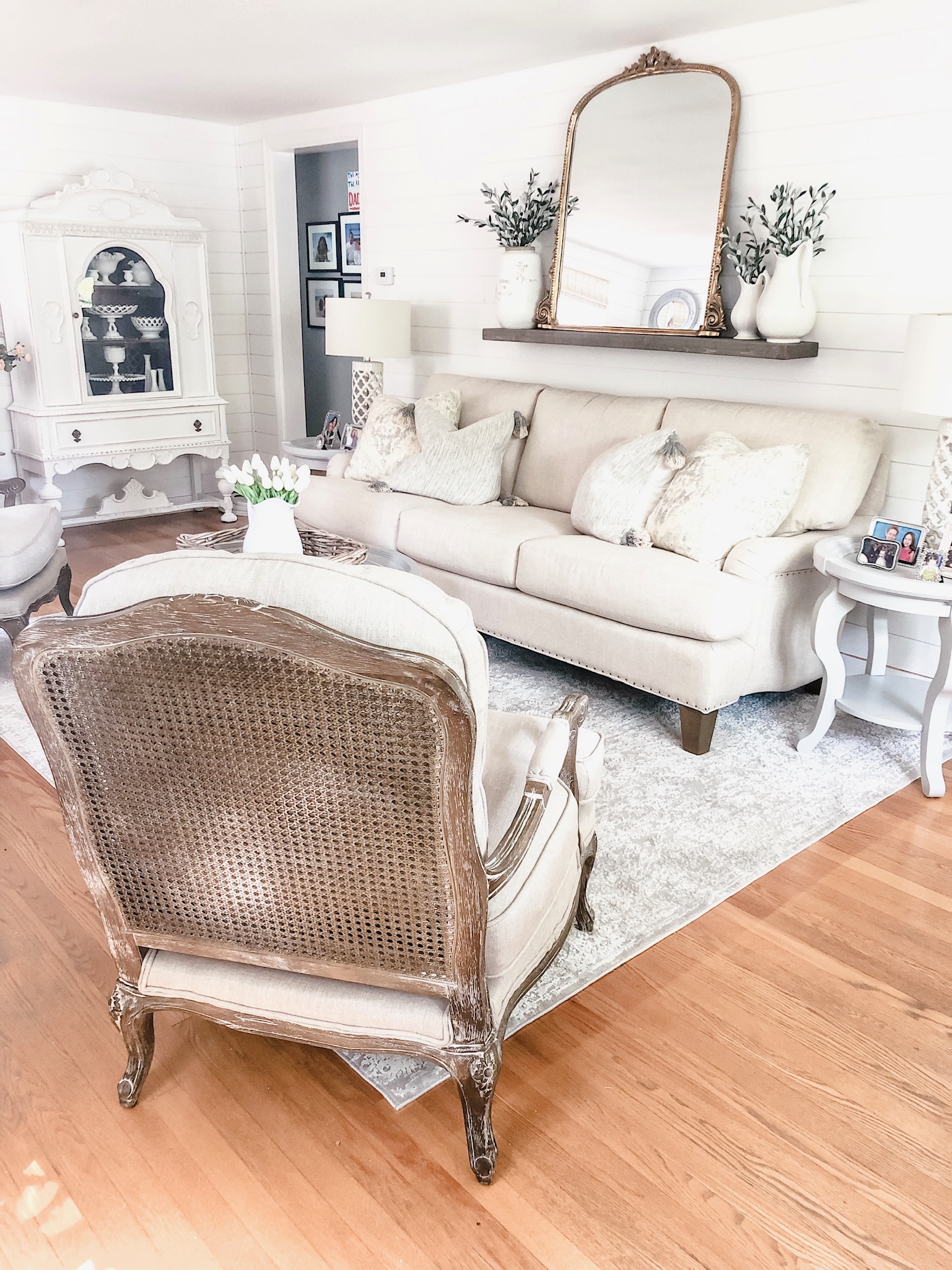
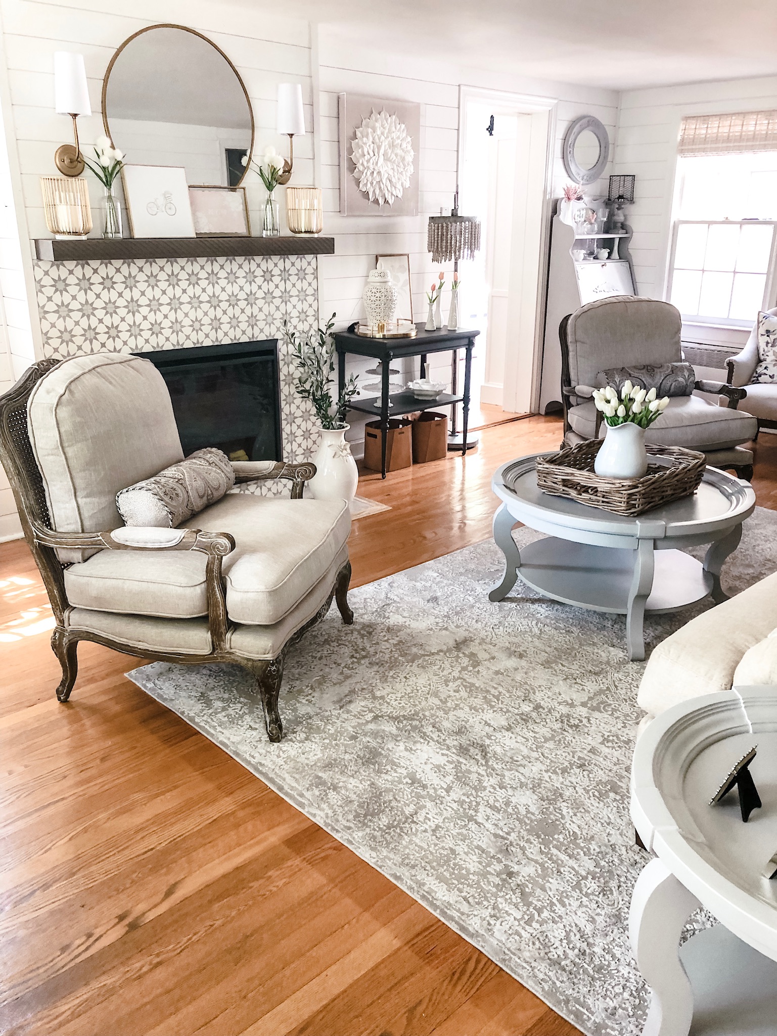
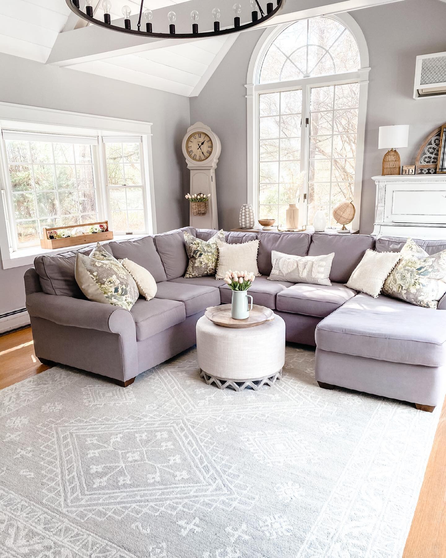
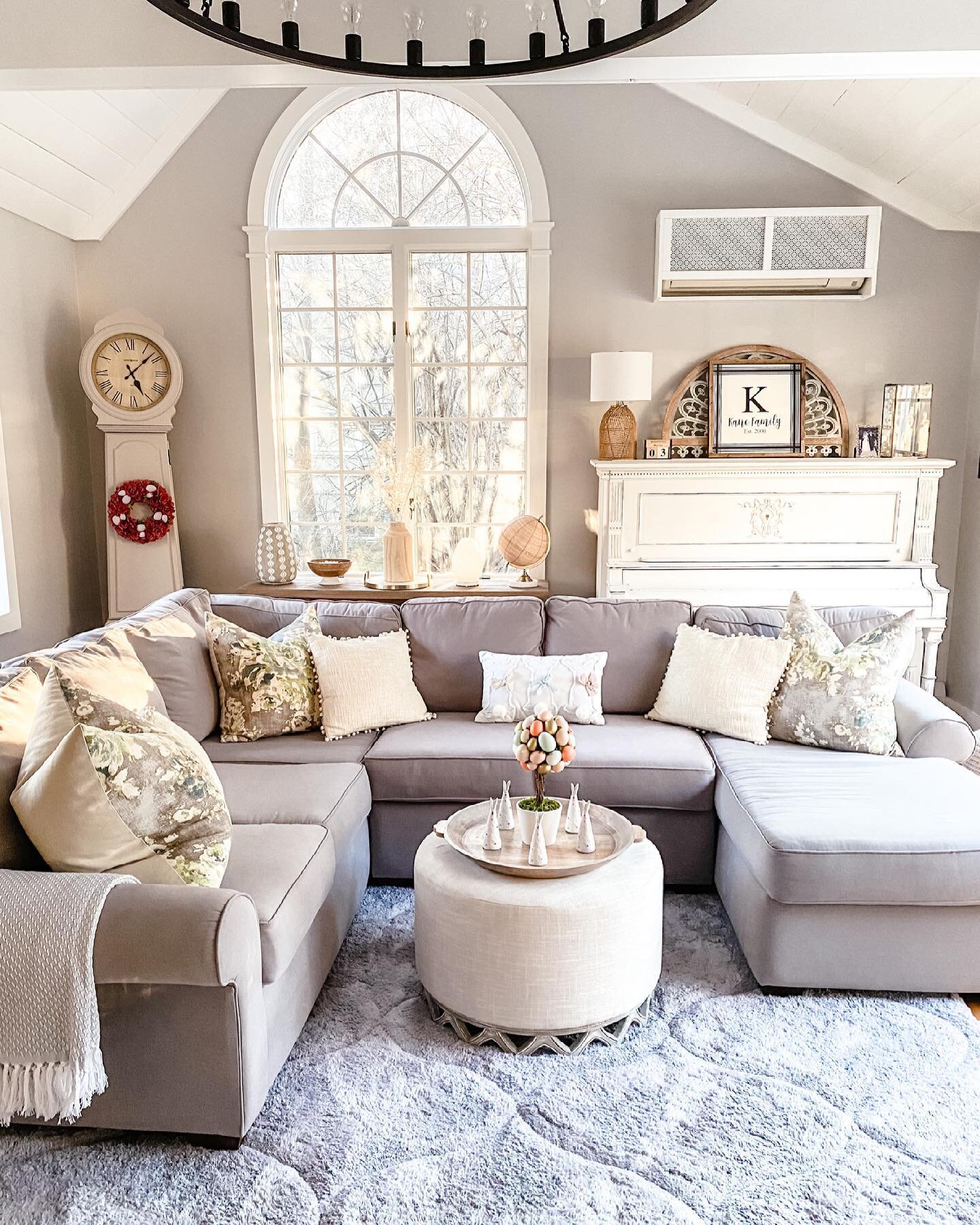
If I had to choose one room in my home that I never felt really worked, and was more of a collection of all sorts of styles, it would have to be my living room. Don’t get me wrong, a room doesn’t have to be match-y match-y to work, in fact I love mixing different pieces and styles together, but this room felt like it had too many competing styles and too much going on. Not to mention it was in dire need of a paint job. The last time we painted it was 16 years ago when we moved in. Every time I tried to photograph it, I just didn’t love the picture.  My eye was drawn all over the place and the navy couch, which I once loved, was now sticking out like a sore thumb with the more neutral pieces.

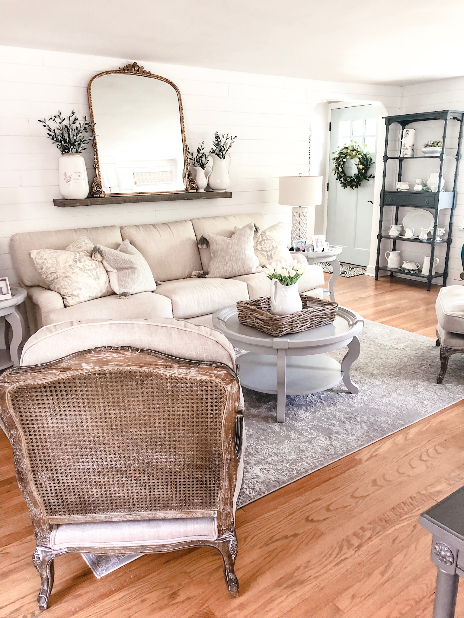
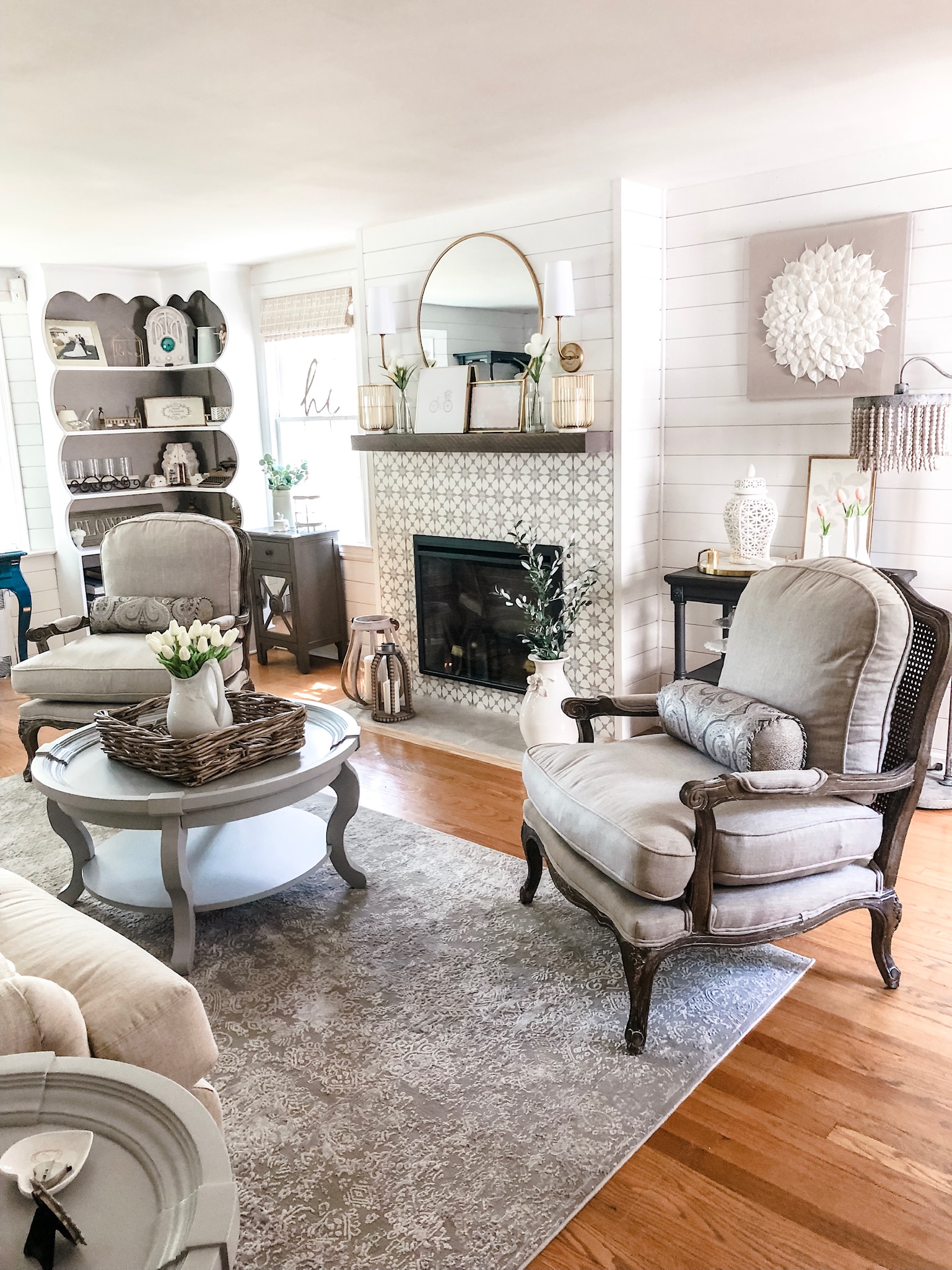
If you recall, when I did the Bloggers Heart Habitat, Raymour & Flanigan fully funded all of the furniture and needs for the home we redid. So, when they approached me about partnering together on a room redo, I jumped at the chance to work with such an amazing company and finally make this room exactly what I envisioned it to be in my mind! A neutral, tranquil space that was sophisticated, yet comfortable, formal, yet approachable. As I say all the time, I love spaces in my home to be beautiful, but also able to be lived in and on. For this room, I definitely wanted it to have accents of my growing obsession, french country decor! I hoped for cane chairs with thick, pillowy cushions and a tufted sofa that had a soft, romantic shape and arm. I wanted a round coffee table, and end tables that had a bit more of a presence to them! What I found at Raymour and Flanigan was all of these things! Their showroom is filled with choices and an incredible selection and the customer service was top notch. I felt like the gentleman who helped me select the pieces had my best interests in mind and listened carefully to what I was trying to create. A couple of the pieces were special order and he combed the store looking for fabric samples similar to those pieces so I would be certain I was getting exactly what I wanted. The pieces that were in stock were available in three days or less, which was amazing and the special order pieces came in long before anticipated. Delivery, which is seven days a week, was seamless! Overall, it was a wonderful experience!

Here is the reveal!! Here are the before and after pictures:

IMG_0093-1.jpg
IMG_0096-1.jpg
IMG_0094.jpg
IMG_0095-1.jpg
IMG_0089-1.jpg
IMG_0098-1.jpg
IMG_0103-1.jpg
IMG_0100-1.jpg
 

BLOGGERS HEART HABITAT PROJECT

IMG_0060.jpg

Words cannot begin to describe the excitement I felt when my sweet friend Charlotte, from At Charlotte’s House, asked me to be a part of an incredible project she began a few years ago. The project is called Bloggers Heart Habitat and with it, she has found the perfect way to combine her passions for design, decor and doing good! Each time, she gathers up a team of Interior Designers and Decor Bloggers (for this one, it was Diane from The Rath Project, Carli from Fearfully & Wonderfully Made By Carli, Michelle from Weekend Craft, Kelly from Street Flea Style, Jessica from Jessica Brigham, Kate from Kate Smith Interiors and Robin from A Home To Grow Old In) and together we have the privilege of making over rooms in a new house built by Habitat for Humanity with the help and generosity of Raymour and Flanigan. Not only did they provide the furniture, but they also provided us with a cash stipend for extra items and accessories to make the space feel more cozy.

We broke into three groups to tackle the three rooms we were working on – the girl’s bedroom, the master bedroom and the living room/kitchen area.

I worked with Charlotte and Kate on the little girl’s room. The family was very open and not too specific. They did say that they try to incorporate Feng Shui – “the use of energy forces to harmonize individuals with their surrounding environments” into their living areas so we were able to add elements into the room. Here is the before photo of the space.

IMG_3764.jpg

We chose a beautiful bed and dresser with a changing table attachment and put them on opposite walls – the bed by the window and the dresser as you walk into the room. We added some fun, furry friends in the corner and a sweet arts and crafts table to the space as well. We incorporated the Greek key pattern on the pillows because it stands for power and prosperity as well as the bamboo mirror and the elephant planter because they are symbolic of luck within the principles of Feng Shui.

IMG_0054.jpg
IMG_0056.jpg
IMG_0053.jpg
IMG_0058.jpg

When the family and their little girl saw this room for the first time, it was pure magic. Not only did they love all of the elements of it, but they said over and over how it was now a home. They were in disbelief, and at the same time, thrilled that this was THEIR home. As someone who prides themselves in making people’s houses into homes, more meaningful words could never have been spoken. The graciousness and appreciation from this beautiful family was so incredible. The happiness my heart felt could not be contained! We did it and now this lovely family has a beautiful home to call their own for the rest of their lives!

IMG_0055.jpg
IMG_0061.jpg
IMG_0052.jpg

Thank you to Charlotte for reaching out to me, Raymour and Flanigan for all of the beautiful furniture and to all of the amazingly talented ladies I had the privilege of working with. This is an experience I will most definitely never forget. Please make sure to head over to the other blogs listed above to see the other rooms that were completed in the home!

image2-1.jpg


2 Comments

Designsite

Designsite is an award-winning website, digital marketing and branding firm, based in Fairfield CT. We’re an original Squarespace Expert and have helped over 200 startups, nonprofits and businesses of all sizes build a successful online presence. Please contact us at info@designsite.com to learn about how we can help your business.

EMILY’S ROOM REFRESH WITH OVERSTOCK

I am so excited to finally reveal Emily’s room refresh! I have mentioned it in my stories a bunch. Now I want to show you and take you through everything we chose to update her room with and it’s all from Overstock. I have been a loyal Overstock customer for years now. I feel like their prices cannot be beat and their products are not only affordable, but also beautiful and long lasting!
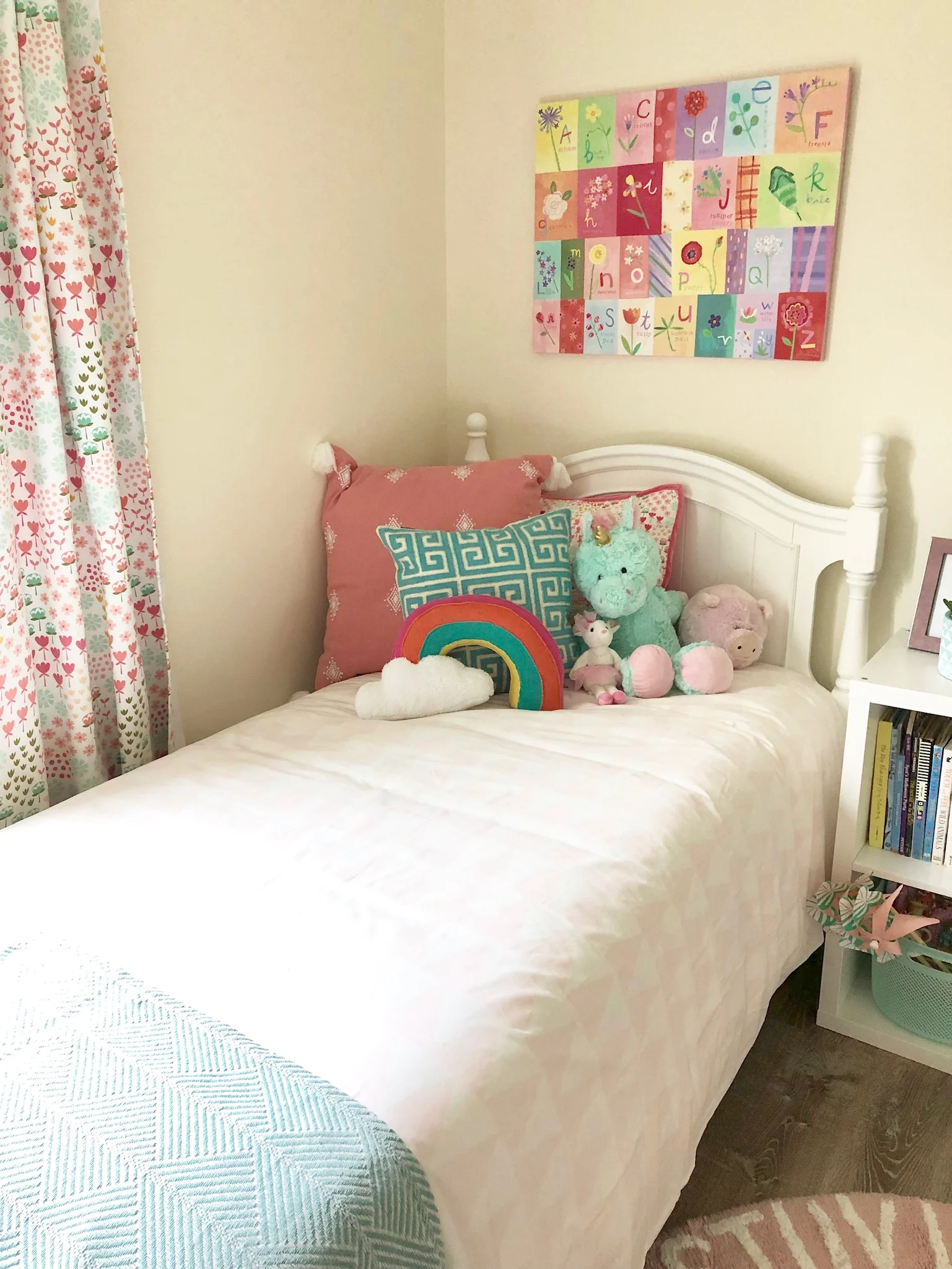
Emily, being the second child, received all the furniture hand me downs. The majority of the items in her room were 14 years old and meant for a nursery/small child. We knew we wanted to update her bed, dresser and night stand to accommodate her growing needs. We also decided to update her light fixture and bedding to add a little more personality to her room!

We sat down together and started our online shopping expedition with Overstock. They have so much inventory and so many styles, it’s hard not to love everything! We narrowed it down, taking colors and styles into consideration and ultimately landed on the Arielle Antique White Sleigh Bed with Trundledresser with mirror and Night Table. We loved the antique feel of the knobs and pulls on a modern piece of furniture. The drawers were deep and spacious (amen for all the clothes) and the trundle will make it so much easier to accommodate sleepovers and guests. We chose the Avery Home Lighting Princess 4-Light Chandelier because it was elegant with its crystal drops and reminded Emily of a “princess chandelier”. Last we chose the Sweet JoJo Designs Blush Pink, Grey and White Chic Watercolor Floral Collection Twin Size Comforter, because we both love florals and soft colors and felt it would match nicely with the new wallpaper. We wanted her room to reflect more of who she is now – a spunky 10 year old and one that could grow with her into her tween/teen years! It was so amazing to see Emily’s eyes light up as we unpacked each item! The squeals and wonder at these items that were all her own! Assembly was a breeze and quality was amazing!

One of things I love most about Overstock is the variety they offer, the discounted prices (and awesome coupons they send through email) and the fast, free shipping. Their customer service is amazing and is so important when shopping online. It can be hard when you cannot see and feel a product, but their return policy and customer service make it so easy to try products out. We couldn’t be more pleased with how this room turned out and feel beyond blessed to have been able to work with Overstock on this project.

 
IMG_0022.jpg
IMG_0019.jpg
IMG_0018.jpg
IMG_0021.jpg
IMG_0020.jpg

xSEASONAL AND HOLIDAY DECORATIONS

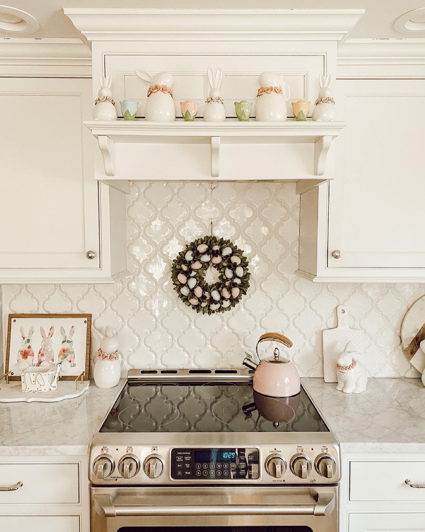
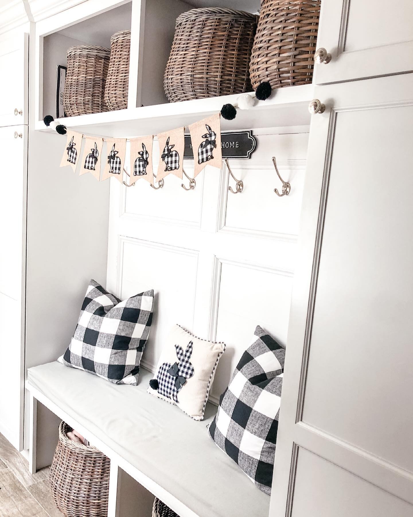
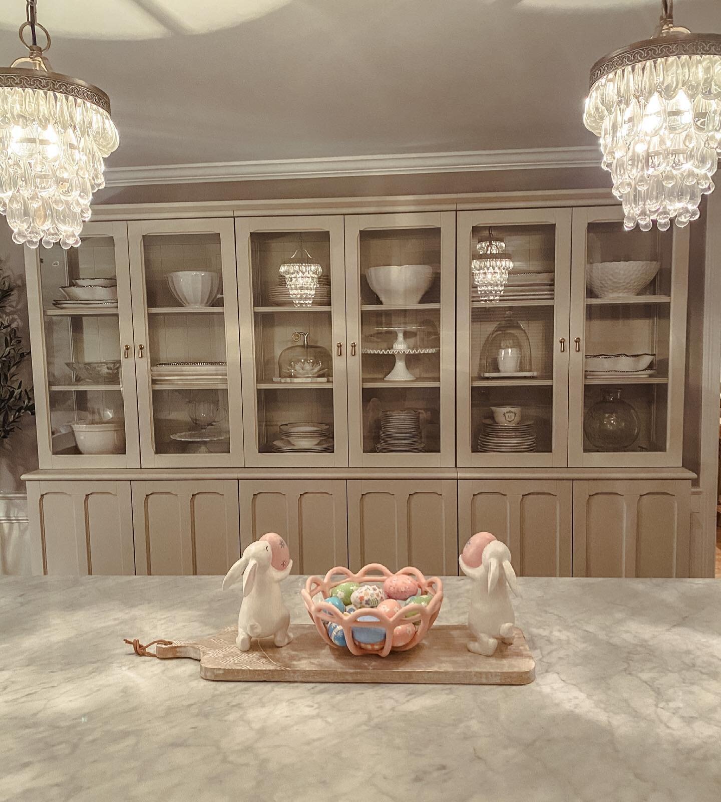
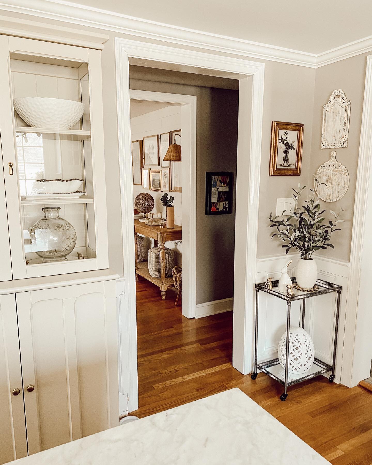
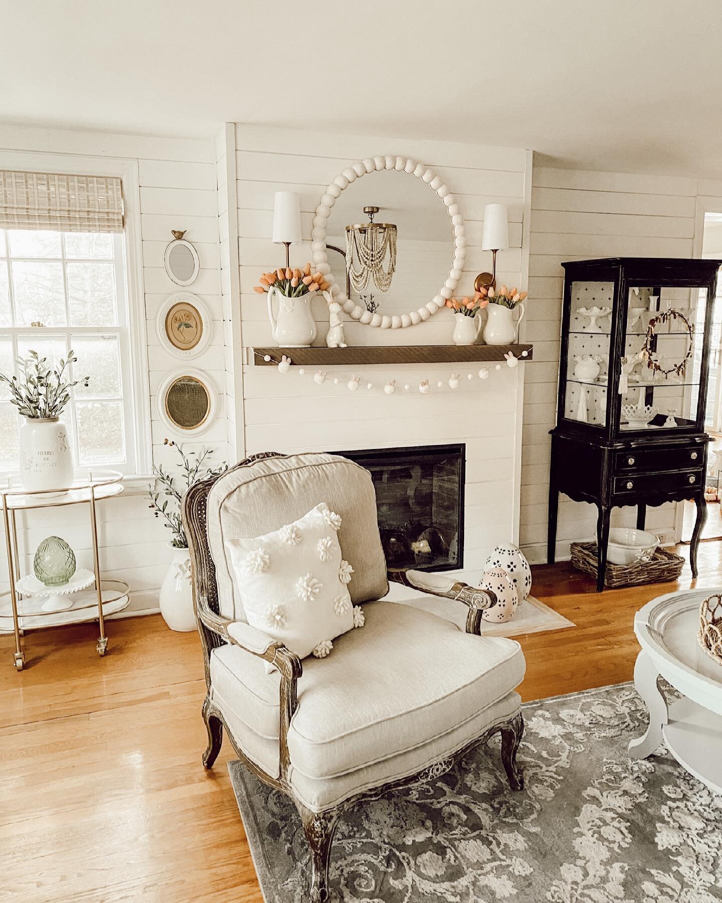
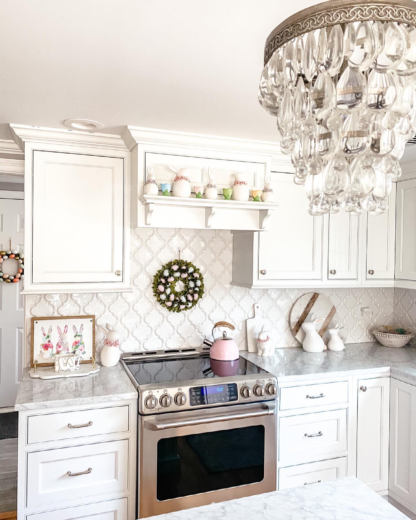
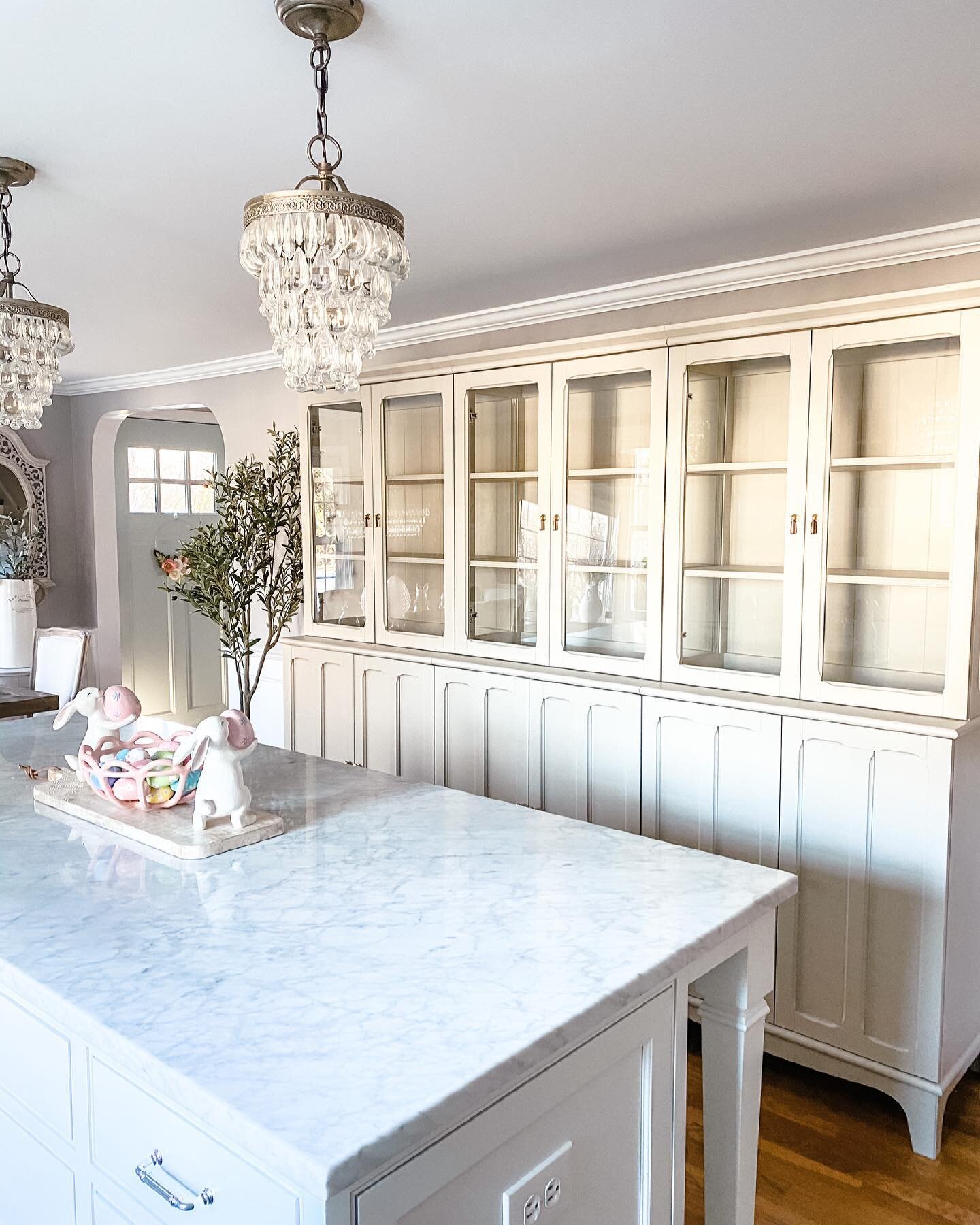
Well, here I am, FINALLY writing this blog post I have been talking about for the last few days! You voted and the winner was seasonal/holiday decorations! When a new season approaches, I think about the colors I associate with that season. For spring, those colors are soft, pale pinks, greens and yellows. Honestly all pastel colors, but I narrowed it down to those three. I then think about spaces that I want to sprinkle in some fresh seasonal decor. In my house, those areas are pretty much any tabletop (haha – just kidding, maybe)! In all seriousness, the areas I usually focus on are: my kitchen, the shelf on the hood above the stovetop, the areas to the left and right of the stovetop, the island and the dining tabletop. In the living room, it’s usually the mantle, although this year it was spring-y enough! In the family room, the console table and the piano and the mudroom kind of in general! Also, the back porch always gets some love, the front porch, not quite yet and all doors inside and out as well. If anything is leftover, I sprinkle some fun in the bathroom too!

So, what do I use to spruce things up? Given that spring coincides with Easter, I always gather up some bunnies, eggs, trees and wreaths from my favorite stores such as Homegoods, TJMaxx, Marshall’s, Pier 1, Target and Hobby Lobby. The first 4 stores are BY FAR my absolute go to’s for holiday decor, while I use items from the others to fill in! Wreaths and florals are another way and we CANNOT forget about my all time favorite – GARLAND!!! If I could hang garland in every room, I would! I try to keep my holiday decorations fairly muted – no super bright, harsh colors and even though we are talking about bunnies, I try to keep it classy and somewhat sophisticated to match with my other decor, so it doesn’t stick out like a sore thumb. I planned my kitchen decor around a wreath I got at Pier 1 this year that I can’t find online. I played off of its many colors! I love keeping my scale from Decor Steals out all year long and putting some green boxwood wreaths like these under whatever decoration is appropriate.

For my back porch, I got this and these to fill it and put out some simple eggs like these these and these on my antique chair. I got a doormat similar to this and am going to layer it over this that I just ordered. My front porch has this doormat layered over this rug.

My favorite place for florals are amazon for these incredibly real tulips, Michael’s for flowers and Hobby Lobby for greenery like this. This greenery is my absolute favorite, I have it all over, not just during spring or holidays. Its soft, feminine and a little more delicate than a lot of other greens out there.

Decorating for the holidays should be fun. It should be fairly easy and not too involved. I hope I have provided you with some ideas for how to spruce up your home!

 
IMG_0017.jpg
IMG_0016.jpg
IMG_0015.jpg
IMG_0012.jpg
IMG_0011.jpg
2 Comments

Designsite

Designsite is an award-winning website, digital marketing and branding firm, based in Fairfield CT. We’re an original Squarespace Expert and have helped over 200 startups, nonprofits and businesses of all sizes build a successful online presence. Please contact us at info@designsite.com to learn about how we can help your business.

DIY CHALK PAINT PROJECTS AND WHERE TO FIND THEM

I must start this post by explaining that I am by no means an expert on anything I speak of below. I’m just sharing what has worked for me, a novice, at painting and rehabbing furniture.

Lately, I have been obsessed with finding vintage furniture pieces and rehabbing them. I have a newfound love for this process and I have to say it is so much easier than I perceived it to be. You do NOT have to be any type of expert at this. If I can do it, I promise you can do it and I have to admit, I’m hooked. I find it an inexpensive way to be super creative and when I am done I feel so proud and such a sense of accomplishment!

For all of my projects, I began by scouring Facebook Marketplace! You would be amazed at the vintage pieces you can find for such incredible prices on here. One tip – don’t be afraid to negotiate. Offer what you consider a fair price and a bonus is offering to pick it up that day. Most of the time, people want these pieces out of their homes to make way for new items or because they are moving, etc…Another tip, be consistent. If you have a piece in mind that you are searching for, continuously search for that piece daily. I did that with these items, everyday for a couple weeks and was able to find everything I was looking for.

The beauty of chalk paint is that prep work is non existent! All you have to do is start to paint! Get a drop cloth, take any drawers/hardware out and off and get started. I have used Rust-O-Leum ultra matte chalk paint in both Linen White and Aged Grey.  This paint goes on smooth and is amazing. In all cases, I have used two coats to get the complete coverage needed. This is a great painting set to get you started, because it has the tray, brush and roller. We were able to use a roller on a lot of areas on each of the pieces we painted. This saved time and provided great coverage! To add interest on one piece – a secretary desk that was rather plain, I added these these and this this before painting.

Now for distressing…the very word scared me so much…until I just dove in. Then it became a fun challenge! Again, a novice at this too, I had no idea what I was doing! I studied some pieces that had been distressed on Instagram and realized that it’s best to distress areas that would get traffic, corners, edges and any detailed trim work you want highlighted. Paint can tend to cover up the details of trim work, so in order to make it “pop”, you can simply distress it! I started out on a learning curve! I got these gloves to keep my hands from falling off! I began with sandpaper and quickly realized that if it was a large piece, that was not going to cut it! I ended up using and really liking these sandpaper blocks.  I try to wait a day before distressing, though sometimes my excitement, coupled with my impulsivity, do not allow me! These may not be the most cost effective way, but to me, they are the easiest and most comfortable. Make sure you are sanding on a drop cloth, because the dust goes EVERYWHERE!!! My husband has a mini shop vac like this one which is AMAZING for cleaning up in the wake of distressing! Not all pieces need to be distressed, it’s really a personal preference. The most recent piece I did, I ended up not distressing for a more polished look.

Once your project is painted and distressed, many people encourage sealing the final product with wax. It can be a clear wax, keeping the original paint color, or one with a stain color to darken the piece. I have not actually waxed any of my pieces, because they are not high traffic pieces that will be used a lot! If you are painting anything that will be getting a lot of use, I would highly recommend this. Since I have yet to use it, I don’t feel right recommending one to you, as I like to only recommend products I have tried and liked. I am sure the paint department at Home Depot can help though! I’ve included pictures of all the pieces I have painted and distressed.

My final piece of advice…take the chance, believe in yourself and your capabilities, have fun, and remember it’s just paint! If you don’t like it, you can always paint it again! Good luck, YOU CAN DO THIS!!!!

 
IMG_0008.jpg
IMG_0003.jpg
IMG_0009.jpg
IMG_0006.jpg

WELCOME TO MY BLOG

Oh my goodness!!! I am writing the first words on MY BLOG! I, Stephanie, have a blog. What? Ok, apologies, this is just a surreal moment occurring during what has been the most surreal year for me. For those who may be new here, I’m Stephanie, a wife, mom of 2 fantastic kids and lover of all things home decor. I started my IG account, @the_seasoned_home in October of 2017 and I had no idea at that time it would would bring me to this point. I did it almost as a dare to myself, a challenge. I was, and still am, on an extreme kick to challenge myself to do things I once perceived as “scary, uncomfortable making and altogether beyond my comfort zone”. I realized the only way to grow is to get comfortable being uncomfortable, so here I am. I hope to tackle many topics on this blog…DIYs, home decor, recipes and who knows what else! It will be a complete work in progress. I plan to do a home tour soon and will put that on here as soon as possible. I just want to take a moment to truly thank you for taking the time to stop by, this is an absolute dream come true for me and I’m so happy you are here with me along this journey!

IMG_0001.jpg